plot
Syntax
plot(data, [labels], [title], [chartType=LINE], [stacking=false], [extras])
Arguments
data could be a vector, tuple, matrix, or table.
If input is a vector, it produces a single series chart and the vector name is the series name.
If input is a tuple, each element of the tuple is viewed as a series. The elements of the tuple must all be vectors of the same length. Vectors’ names are the series’ names.
If input is a matrix, each column of the matrix is a series and the column labels of the matrix are the series names. If the matrix has row labels, they will serve as data point labels.
If input is a table, each column of the table is a series and the column names are the series names.
labels are the label for each data point. All series of a chart share the same data labels. If input is a matrix, we can set matrix’s row labels as data point labels. Otherwise, we need to specify data point labels here if necessary.
title could be a string scalar/vector. If title is a scalar, it is the chart title; if it is a vector, the first element is the chart title, the second is X axis title, and the third is Y axis title.
chartType is the chart type. The default type is LINE. Other options available now are PIE, COLUMN, BAR, AREA, and SCATTER.
stacking indicates whether the chart is stacked. This parameter is valid when chartType is set to LINE or BAR.
extras is an optional parameter to extend the properties of the function plot. extras must be a dictionary, and its key must be a string. The parameter is supported in version 1.30.13 and later.
Note: Currently, extras only supports multiYAxes attribute: {multiYAxes: true}. Set to true to support multiple Y-axis, and set to false to use a shared Y-axis.
If you need to use extras to add new attribute names and types, please contact us.
Details
Generate a chart object.
Examples
Example 1: plot a table
$ x=0.1*(1..100)
$ y=0.1*(100..1)
$ t=table(x,y)
$ plot(t,extras={multiYAxes: true})
The graph above can also be generated by plot(t[`x`y],extras={multiYAxes: true})
Example 2: plot a matrix
$ plot([sin,cos](x),x,"cos and sin curve",extras={multiYAxes: false})
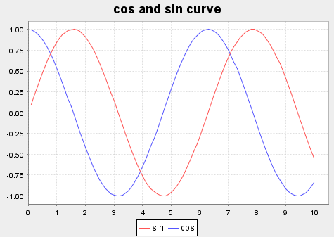
Note that function names are used as series names, and we specify data labels and the graph title.
Example 3: plot a vector
$ plot(cumsum(x) as cumsumX, 2012.10.01+1..100, "cumulative sum of x")
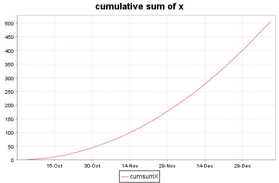
cumsumX are used as series names.
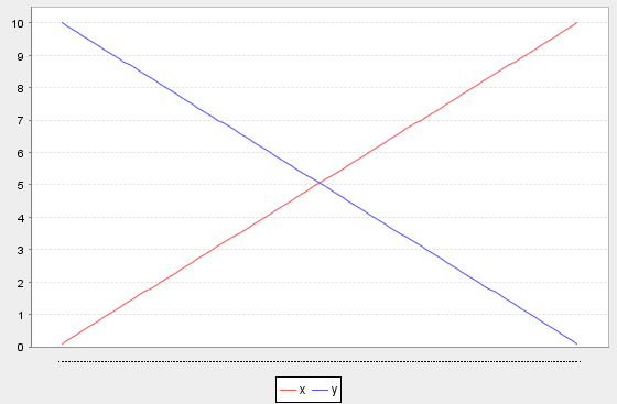
Example 4:plot a tuple
$ plot([1..10 as x, 10..1 as y], 1..10, extras={multiYAxes: false})
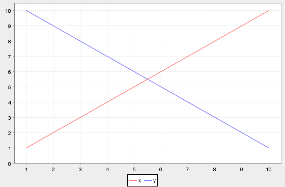
x and y are used as series names.
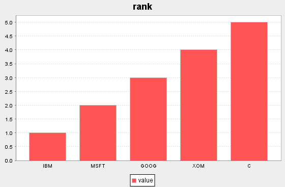
Example 5:plot a bar graph
$ plot(1..5 as value, `IBM`MSFT`GOOG`XOM`C, `rank, BAR)
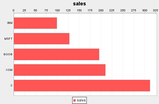
Example 6:plot a column graph
$ plot(99 128 196 210 312 as sales, `IBM`MSFT`GOOG`XOM`C, `sales, COLUMN)
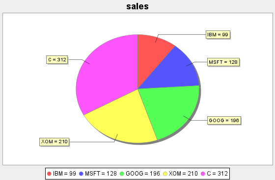
Example 7:plot a pie graph
$ plot(99 128 196 210 312 as sales, `IBM`MSFT`GOOG`XOM`C, `sales, PIE)
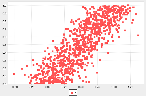
Example 8:scatter plot
$ x=rand(1.0, 1000);
$ y=x+norm(0.0, 0.2, 1000);
$ plot(x, y, ,SCATTER)
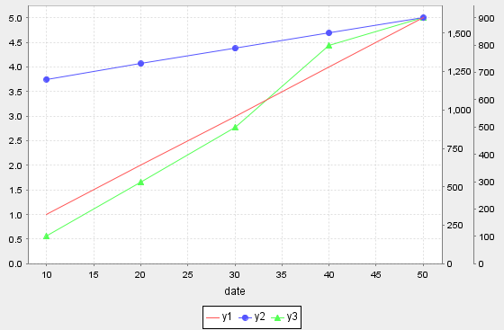
Example 9: Set {multiYAxes : true} and y1, y2, y3 represent different Y axis.
$ t = table(1 2 3 4 5 as y1, 1200 1300 1400 1500 1600 as y2, 100 300 500 800 900 as y3, 10 20 30 40 50 as date)
$ plot([t.y1, t.y2,t.y3], t.date, , LINE, ,  {multiYAxes : true})